Logo Refresh: Before and After
We were recently asked to update the logo for a company in the small cell industry. As the offshoot of a power company that has been going strong since 1964, they wanted a look that projected the same expertise and quality that their parent company has exuded for the last half a century, with a cleaner and more modern feel.
Original Logo
-

Old American Cell logo
Even though their logo wasn’t that old, something about the muted red and blue made it feel old fashioned.
- The colors and round layout were reminiscent of several baseball team logos.
- The “A” within the cell tower got lost in the complexity of the line art, while the C winding through it seemed like an afterthought.
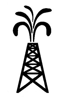
- Because the company name was so much smaller than the brand mark, it took a back seat to the mark itself. And if you didn’t already know what American Cell did, you might think they were in oil the oil business—the cell tower line art is easy to confuse with an oil derrick:
Updated Logo
-
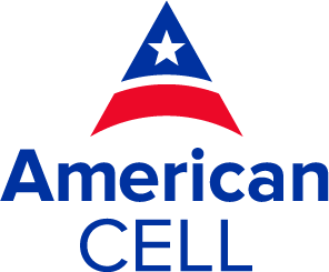
New American Cell logo
In color theory, red is a color of power, while blue conveys trust. We opted to retain the red, white and blue color palette—but used richer versions of those colors.
- The logo as a whole is less intricate. The brand mark itself, while simpler, still calls to mind both the letter A and a stylized cell tower.
- There is more balance between the size of the company name and the brand mark. Taking the mark out of the center allows you to focus more on the company name and less on what exactly the mark is.
The end result is a more refined, modern image for the company—one that conveys the sense of experience and trustworthiness they were seeking.
