Rebranding the Right Way
The decision to rebrand isn’t one to be taken lightly. When done wrong, rebranding can destroy trust and ruin any brand equity you’ve built up. But done properly and for the right reasons, it can revitalize your company, increase your relevance and help you reach a broader audience.
Our client American Share is the perfect example of rebranding done right.
Recognize the Need for Rebranding
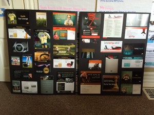
Old marketing collateral
Old logo
Founded in 1974, the company provides a unique, private insurance product for credit unions. Their only competitor is a federal agency whose rules and regulations make it difficult for credit unions to take advantage of American Share’s private option. Their business growth slowed due to a perfect storm that included changes in the coverage provided by the federal option and the Great Recession that hit the financial industry in 2008.
By 2015, American Share had successfully weathered this storm and the board and management team started to ask themselves some very important questions:
- Is our image well developed?
- Are our marketing tactics dated?
- Is our messaging consistent?
- Where do we stand in the marketplace?

Mood board
They enlisted us to help answer these questions through our Growth Catalyst process.
Work from the Ground Up
We conducted a marketing analysis along with one-on-one discussions with American Share’s leaders, partners, marketing team and customers. Our research showed that American Share was a viable and necessary alternative in the market—but as management had begun to suspect, perceptions of their brand and marketing were part of what was holding them back.
Their logo felt dated. Their color palette was dark and, in the words of their President/CEO, “too gothic.”
Further, existing ads and other messaging were confusing, and the company was virtually unknown by anybody who wasn’t actively seeking an alternative to the federal option.
Capitalize on What Makes You Unique
Logo concepts

Color palette options
We began to work on a new look and message for the company that would help them stand out, reach new audiences and emphasize their unique advantages. We developed mood and brand boards to establish the tone and direction for the rebranding. These foundational pieces helped us formulate American Share’s marketplace distinctions, core values and mission and set a course for developing the brand.
Exploring traditional brand archetypes, we determined that American Share’s mission and vision perfectly exemplified The Hero/Protector: they want to improve and inspire their industry. They’re honorable and strong. They value quality and efficiency.
New logo
Explore Your Options
Working with the management team, we went through several rounds of color palette options and logo concepts.
Along the way, American Share’s candid feedback helped us home in on what would ultimately become the final brand concept.
Refine Your Choices
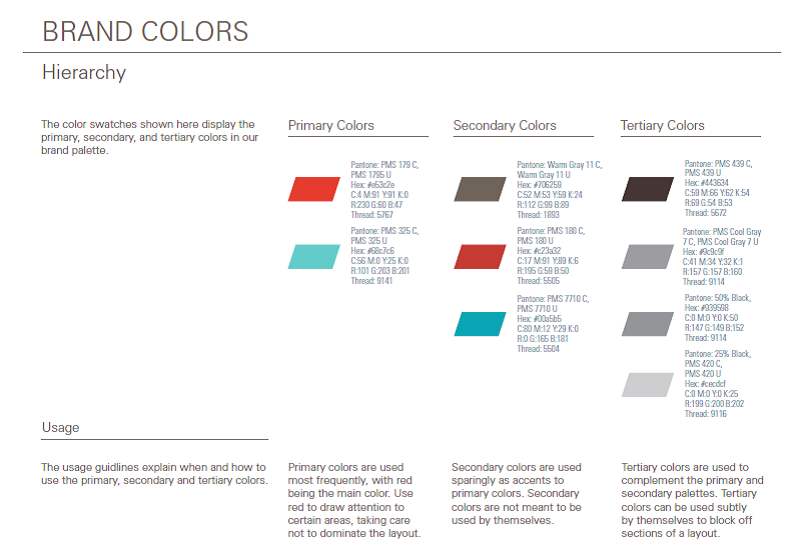
New color palette
Even after American Share made their final choice of a logo and color palette, the brand continued to evolve. Subtle tweaks to fonts and hues resulted in an end product that met all of our objectives.
The shield symbolizes the company’s protective, helpful nature. The “A” created by the negative space is a nod to the transparency that is one of American Share’s core values. The typography is bold and progressive. The final, modified red, white and blue palette is modern, fresh and clean.
We also created an extensive brand guide to ensure consistent application of branding elements and messaging on future marketing materials.
Build Excitement
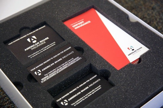
Rebranding kit contents
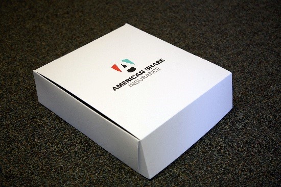
Rebranding kit
Rolling out the new brand the right way was especially important to American Share. Not only did they have their own corporate materials to consider, they also had signage and materials in all of their member credit unions. Before the official launch, the company sent out a letter to the credit union CEOs with a sneak peek of the upcoming rebrand.
In addition to explaining the rationale behind the change, the letter announced that American Share would be sending out rebranding kits to help the credit unions update the American Share signage and marketing materials in their branches. The kits included tabletop signs, window and door decals, and a packet of consumer brochures, as well as instructions for ordering additional materials via the American Share website.
Another of the company’s marketing needs was a website overhaul, but American Share didn’t want to wait for the new site to get the ball rolling with their brand. In the meantime, we created a temporary landing page that showed the new branding, creating more excitement and interest in what was to come. This gave us plenty of time to develop and test their new site, which went live the first week of June.
Finish Strong
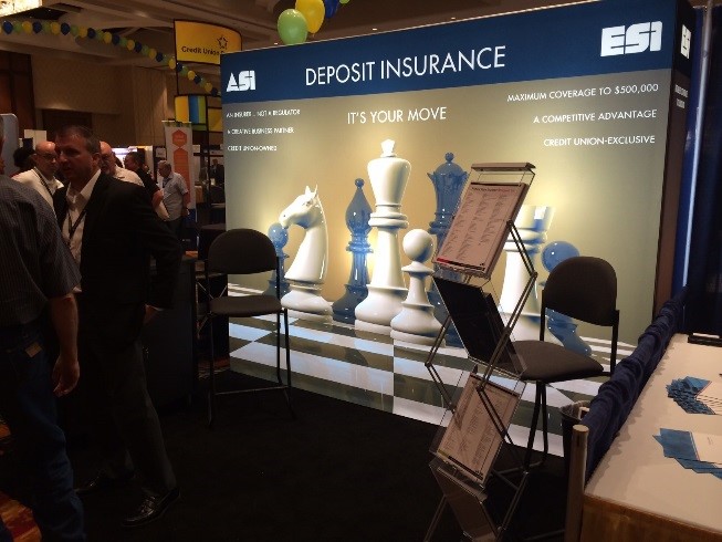
The launch of the rebranding coincided with one of the largest credit union trade association conferences of the year, and American Share was a major sponsor. We created a new tradeshow booth and materials, while American Share ordered apparel and booth giveaways featuring their new logo.
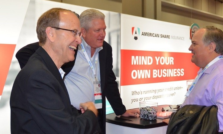
New tradeshow booth
Old tradeshow booth
In contrast with their previous booth, the new booth is bright, bold and enticing. The headline “mind your own business,” which we incorporated into the sponsorship ads and handouts, grabbed attendees attention and gave American Share team members the opportunity to describe how credit unions can gain more control over the day-to-day operations of their businesses when they choose American Share.
American Share’s new brand and message has continued to roll out in updated signage, stationery, annual reports, ad campaigns and social media profiles.

Hey Jason, Archetypes are such a powerful positioning tool when used correctly yet they are still very much underutilised as a brand strategy tool – This one goes into great detail – https://iconicfox.com.au/brand-archetypes/
Thanks for sharing!