We Need Some Space
…white space, that is. In design, white space is the breathing room in and around content. It doesn’t literally have to be white—it doesn’t even have to be totally empty. But regardless of whether it’s a color, a pattern or even a background image, it serves the same purpose: to provide a visual rest for your eyes.
What is white space?
Think about a carton of eggs. There’s a lot of space in there that’s not filled with eggs—you could probably fit at least a couple more eggs in there if you reduced the packaging. But you’d probably end up with a lot more broken eggs as a result. The packaging is very much like white space, keeping order among the contents of the carton so they don’t become a scrambled mess.
There are different categories of white space:
- Micro vs. macro: Micro white space, as the name implies, is small amounts of space within the elements of a design—a good example is the space between letters, words and lines of text. Macro white space, on the other hand, is the larger space around elements—you’ll often find it in the outside margins, and between images or columns of text.
- Passive vs. active: Passive white space is used to improve readability within a piece, creating a more positive user experience. Active white space is used to create focal points around important information. You might create it by adding more white space above and below a particularly crucial sentence, or even by removing white space by making that same sentence bolder (thus reducing the white space between the letters).
How is it used?
The main purpose of white space is to give you a moment to process what you’ve just read or seen before you move on to the next block of content. But it can also be used as a branding element to convey a more sophisticated tone. It can even be used to create an image in and of itself—like the arrow in the FedEx logo, or the A created by the shield-shaped color blocks in the American Share Insurance logo.
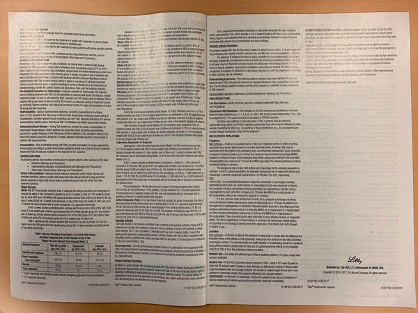
It creates a sense of harmony in a design (as in the full-page print ad below)—whereas a lack of white space can cause feelings of tension (as in the two-page spread below).
The spread on the right is the fine print that follows a pharmaceutical ad on the previous page. Because the pharmaceutical industry is highly regulated, there’s no getting around including it—often the sheer amount of language you’re legally required to include forces your hand in the design. But in this particular example, the available white space could have been used to a better advantage between the various sections of side effects, adverse reactions, directions for use and patient counseling instructions.
White space is not wasted space. It’s as important to good design as copy and imagery.


